Production Design by Dante Ferretti
Cinematography by Robert Richardson
Costume Design:
Line:
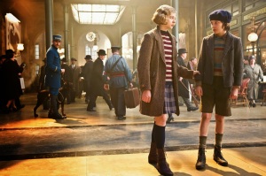
Because the movie is intended to be seen through the eyes of a child, there were no more than two costumes for each character, and costume designs were simple. Stripes were used on a handful of the costumes, including Hugo’s and Isabelle’s sweaters. Similarly, Madame Emilie’s coat and skirt had a zig-zag pattern. These particular patterns made it easy for the characters to stand out amongst the crowds in the station. As stated on the class blog, lines “lead your eye around the composition and can communicate information through their character and direction.”
Form:
Similar to line, form is apparent throughout the rectangular shape of the lines of Hugo and Isabelle’s sweaters. The station inspector’s hat has an almost zig-zag pattern, which also adds depth to his costume. Color: Color was one of the most important aspects of costume design. One of the most prominent examples of color is illustrated by the station inspector’s blue uniform. Powell described that a typical station inspector’s uniform would be navy. However, navy would appear black on screen, so she exaggerated the intensity of the blue in his uniform to assure he would stand out on camera. The value of the blue is also associated with energy, which is perfect because the station inspector is constantly chasing Hugo, as well as other orphans, around the station.
Similar to the station inspector’s uniform, Hugo’s costume featured an intensified blue color, as well as shades of burgundy, orange and brown. Isabelle’s costume was made of navy and burgundy, creating a “French” look. These colors are dull, portraying a serious mood. Isabelle’s outfit matches well against Hugo’s, which is important as the two characters are beside each other a majority of the movie. Together, the reds, oranges and browns are warm colors, while the blues are cool colors.
Texture:
Gestalt Principles
Law of Similarity:
Law of Continuity:
Contexts
Social:
Cultural:
Set Design:
Having an already great idea on how the set was supposed to look like, the use of design principles are found throughout the film. One of the more impacting design principles used is line. When you think about a train station, you automatically think of the tracks and where it will fit among the people milling about the station, or at least I do. Looking at the picture above there are two parallel almost complete horizontal lines that create separation from the two main characters (Hugo and Isabelle). There are many other lines from the lamp posts, to the columns, and also to the bars that make up the window panes in the ceiling. Space was also something that was needed for this film, with it being in 3-D the way that the camera has to be moved needed a lot of space that wouldn’t have been practical in a real world functioning station.
Continuity has been used right from the very beginning of the film in the idea that everything works like a clock with the affect of having Paris work the many gears that create a clock. These gears are seen in many places, not just when the characters are inside them. We also use pragnanz when looking at gears because we only see circles when so much more is going on with them.
The context for the train station is a historical one. It would be very difficult to use a modern train station and make it fit the time and the feel of the story. Like it was said before it would be very hard to close down an entire train station and film the movie.
Visual Effects Design:
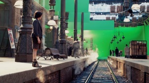
The frame above shows quite clearly a few visual aspects which were finished off by the visual effects crew. In conjunction with the set designer, the visual effect of closing in the roof of the station had to be accomplished by the Gestalt principle of closure. These settings needed to be drawn on computer to match the physical sets, but also fade neatly into a stylized, almost whimsical steampunk look.
A before and after still from a scene later in the movie (though in the same space as the clip we chose) shows how much was done to make the station look complete:

(All images copyright © 2011 Paramount Pictures.)
From the perspective of design, the visual effects crew needed to take the lines and perspective of the basic set design and continue them in order to build the context of the film. In almost every one of these scenes, the use of line shows depth.
As with the set and costume design, the visual effects artists used color very carefully, in order to keep the mood of the overall scene. Colors in the train station are muted, while maintaining a certain warm glow.
Form is also important, and comes into play in many of the scenes. You see many geometric shapes in the station, from the columns to the lights to the speakers and down to the windows and archways. The forms are three dimensional and the way they are lit make the 3-D space very real.
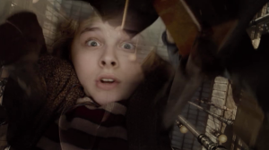
The visual effects designers also needed to play on a few different contexts to make this scene work. Psychologically, the visual effects artists make you feel like you’ve been knocked down like the girl in the scene, using vertical lines and a vertical vanishing point while showing her face looking up. It seems like it shouldn’t work, but it is very effective:
The visual effects artists also use texture well; creating a cold, hard feeling atmosphere, accentuated by the use of real (and CGI) steam.
Director of Photography:
The lighting of the scene is also quite good with the ceiling lights creating a back light that pulls the children out of the group and into the foreground and the light is warm which follows the color scheme.The costumes follow the same color scheme with browns, blues, and reds. The clothing of the children has more color and pattern then the others on set which also makes them stand out along with the blue of the inspector. This follows the law of similarity where the three stand out because of their differences. This continues through the rest of the scene even when she falls and is saved by hugo. It also plays on the social aspects of children being alone in comparison the rest of the adults in the station. The whole movie plays on the idea of the children being set apart from the adults.
The DP of this film has done many other movies, some with the same director, but I haven’t really seen any of them. It would seem that this movie is quite different from his usual though because it is a brighter, family film while most of his other films are darker, less kid friendly, films. It this scene where she falls and looks like she is going to get trampled, the DP plays with the phycological fear by showing her face and her fear and the people towering over her. That is about as dark and scary as the movie gets.

